How to Configure PLPs
This document outlines the configuration options available for Shopify product listing pages (PLP), aka collection pages, allowing customization of page layout and functionality.
*Optional. If there are no inputs, these components will not display.
Note: These configurations can be adjusted in the Shopify dashboard to customize the look and functionality of collection pages.
Product Grid Config
Enable Rollup
Multivariant Product Card ("Rollup" PLP) | Single Variant Product Card ("Exploded" PLP) |
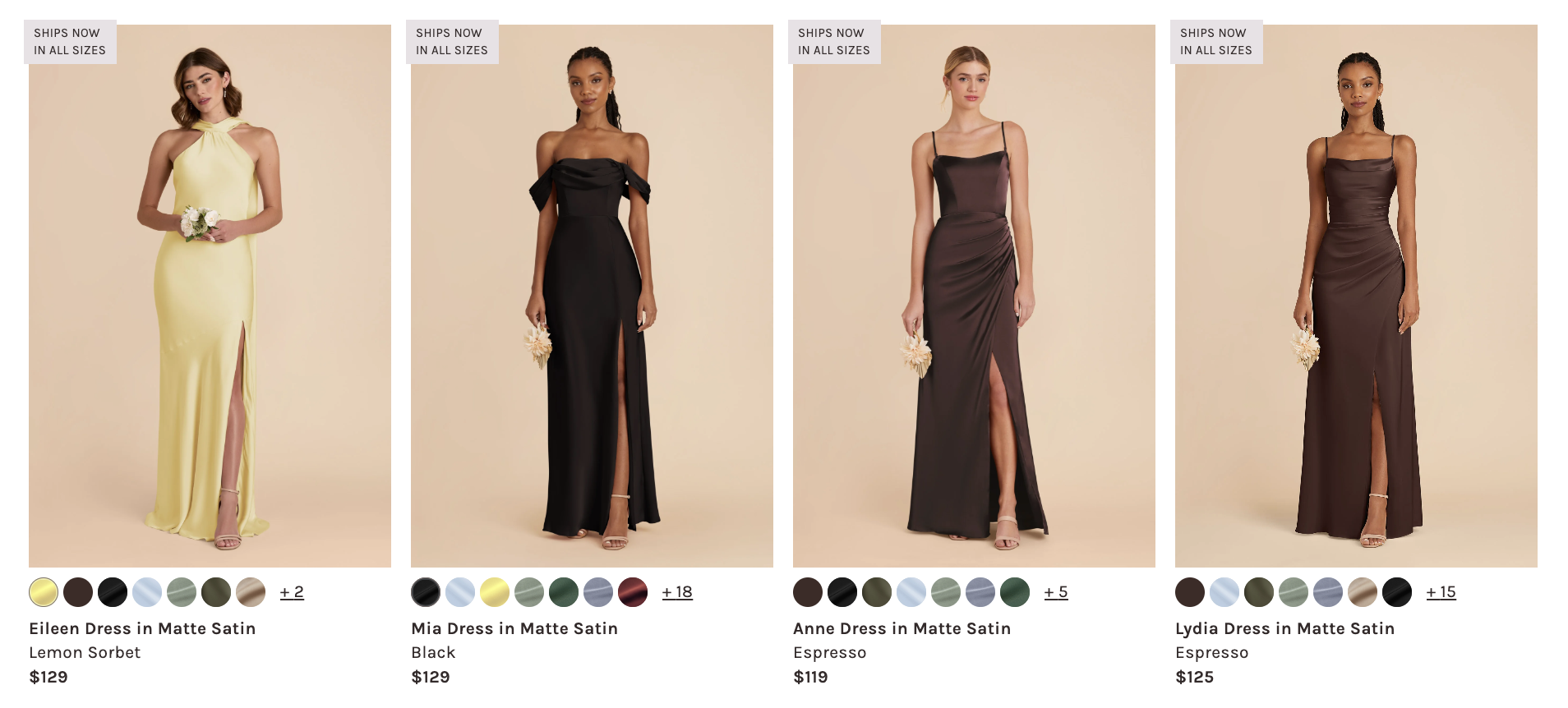 | 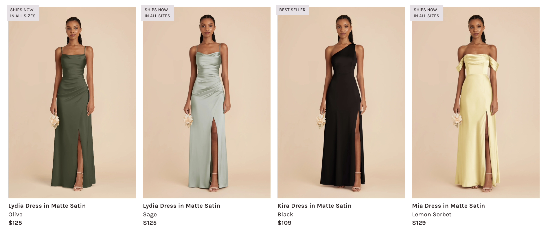 |
Default value: false — displays as "exploded" PLP
Metafield: config.rollup
- Type: Boolean (
trueorfalse) - Function: Controls the display mode of product listings. An "exploded" PLP shows single-variant product cards; a "rollup" PLP shows multi-variant product cards (i.e. displays color bubbles).
Editorial Hero*

The editorial supports either an image or video. If both are configured, video takes precedence.
For detailed documentation, see PLP Editorial.
Header Video*
Metafield: config.editorial_video
- Type: Single line text — Builder Content Model ID
- Function: Displays an autoplaying, looped video. Use the ID from Builder's
plp-editorial-videomodel.
Header Image
Metafield: config.editorial_image
- Type: File upload (Image files)
- Function: Allows custom header imagery for the collection page. Only displays if no video is configured.
Header Text*
Metafield: config.editorial_text
- Type: Single line text
- Function: Displays title text overlay on the editorial (works with both image and video)
Recommendation Trays*
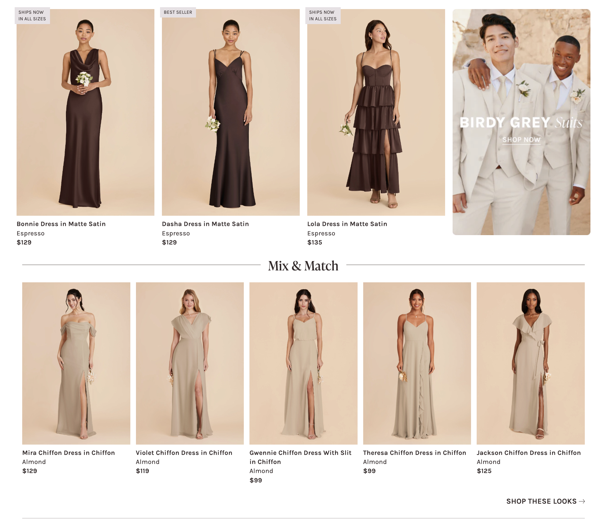
Enabling the recommendation tray will display an upsell carousel that appears between the first line of product cards displayed on the PLP product grid and the next line.
Metafield: config.rec_tray
- Type: Single line text - Builder Content Model ID
- Use the ID attribute from Builder content model
Rec Tray.
- Use the ID attribute from Builder content model
- Function: Adds an upsell carousel on the PLP; experimental marketing purposes.
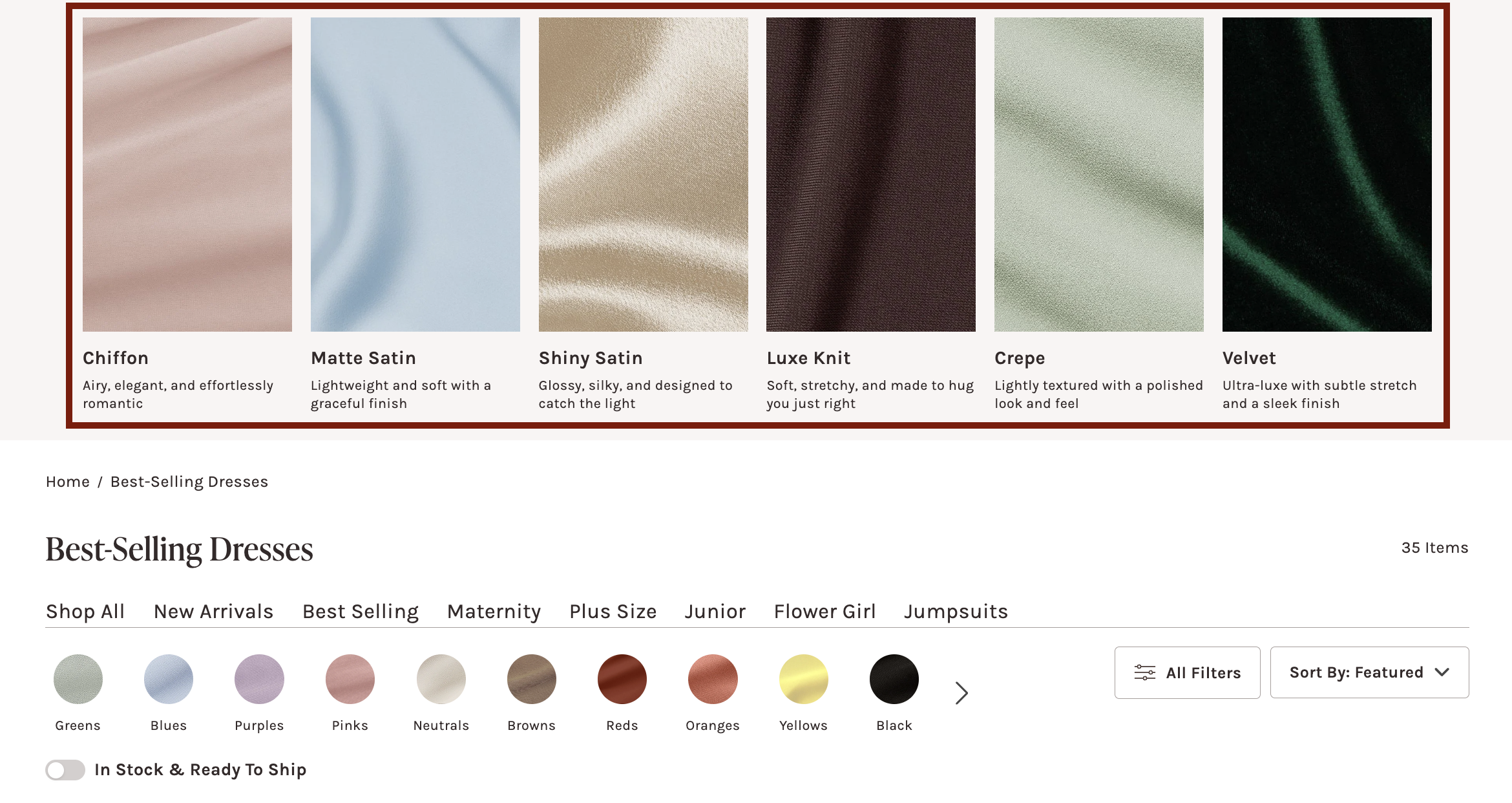
Visual Navigation*
Metafield: config.visual_navigation
-
Type: Single line text - 🔗 Builder Content Model
- Use the ID attribute found in the
PLP Visual NavigationBuilder content model for ths field.
- Use the ID attribute found in the
-
Function: Integrates the PLP Visual Navigation content model from Builder.io to display an upsell marketing component at the top of the PLP.
-
Example: Builder content model ID:
swatch-fabrics- 🔗 Model
Expected:
Collection Header Configs
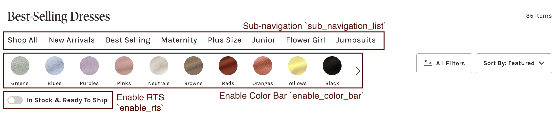
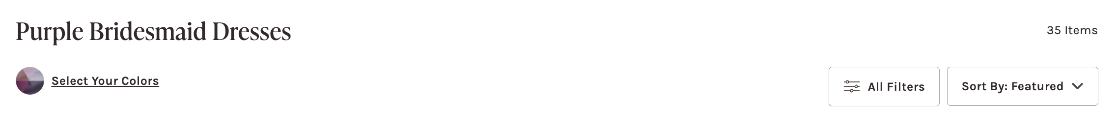
Enable Color Bar*
Default value: false
Metafield: config.enable_color_bar
- Type: Boolean
- Function: When enabled, a color bar will display on: the left of the filter/sort menus on desktop; underneath the filter/sort menus on mobile. Each of the color bubbles will open a modal that will toggle to the color family filters. Clicking on a specific color bubble will automatically scroll to the color family and open the accordion to display color filters.
Sub-navigation*
Metafield: config.sub_navigation_list
- Type: Metaobject (list) — Shopify Collection
- Function: Displays a sub-navigation showcasing special collections; clicking a collection will navigate the user to that collection page. This component will display between the collection header title and color bar/filter menu bars.
Ready-to-Ship Toggle*
Default value: false
Metafield: config.enable_rts
- Type: Boolean
- Function: Displays a toggle to filter for ready-to-ship (RTS) products on the product grid.
Alternate Collection Title*
Metafield: config.alternate_title
- Type: Single line text
- Function: Displays an alternate title instead of the collection title. This can be used for special promotion language: e.g. "Black Bridesmaid Dresses" -> "20% off Little Black Dresses!"
Subtitle Description*
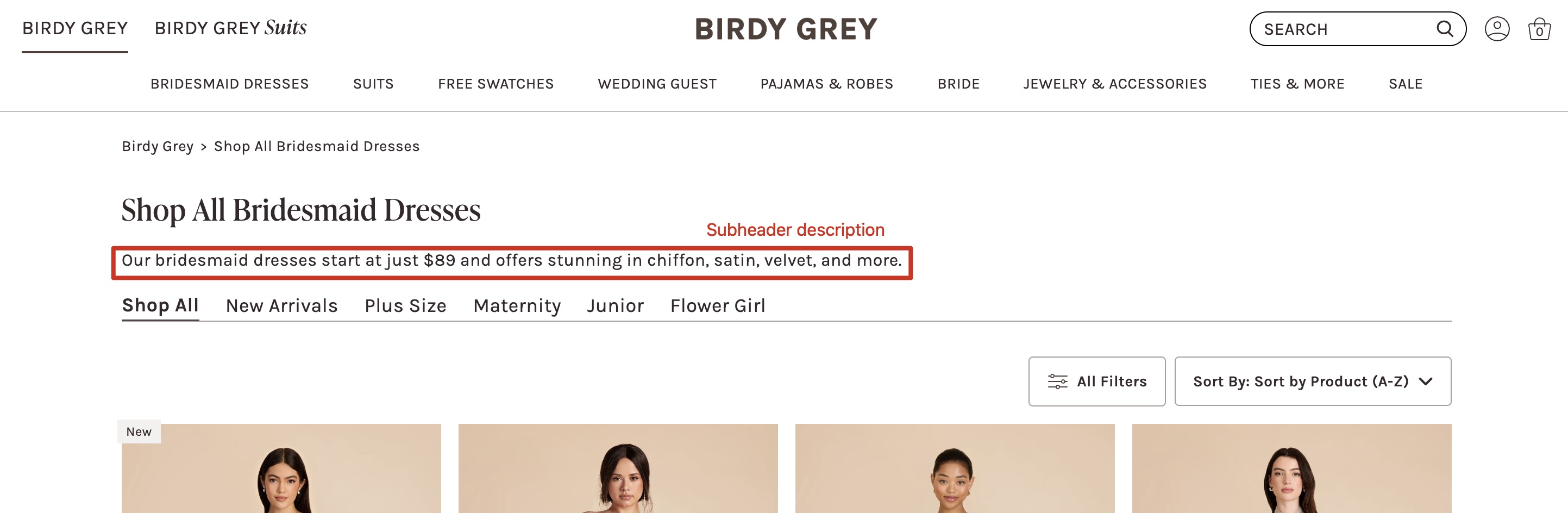
Metafield: content.top_description
- Type: Single line text
- Function: Displays a short plain-text description below the collection title and above the filter bar. Intended for SEO-friendly on-page copy. If the field is left blank, the section will not render.
Enable "Shop All"*
Default value: false
Metafield: config.enable_shop_all
- Type: Boolean
- Function: When enabled, the collection title and breadcrumb title will display "Shop All" before the collection title: e.g. "Little White Dresses" -> "Shop All Little White Dresses"
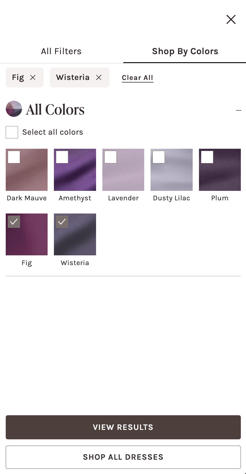
Color Wheel Image*
Metafield: custom.color_wheel_image
- Type: File - Images only
- Function: To enable the
Select Your Colorsbutton, upload an image file to go with the button. When this field andenable_color_baris disabled, the Color Family Filter will display a singular accordion with all the color filters, instead of breaking into the color family accordions. This feature is special for color-specific collections: e.g. "Green Bridesmaid Dresses"