PDP Badges
Badges displayed on Product Detail Pages (PDPs) are managed in the hydrogen-storefront repository using React components with Tailwind styling.
Implementation
Badge Components
PDPs use two primary badge components:
| Component | File | Badge Type |
|---|---|---|
PillBadges | app/components/PillBadges/pillBadges.component.tsx | Pill Badge (max 2 displayed) |
TextBadge | app/components/TextBadge/textBadge.component.tsx | Text Badge (status/promo) |
Rendering Location
Badges are rendered in the ProductInfo component (app/components/ProductInfo/productInfo.component.tsx):
ProductInfo Component
├── Pill Badges (top of product info) ← Max 2 badges
├── Title & Subtitle
│ ├── Text Badge - Out of Stock ← OR
│ ├── Text Badge - First Swatches ← OR (swatches only)
│ ├── Text Badge - Promo ← (mutually exclusive, 1 displays)
│ └── Discontinuation notice ← (not a badge, plain text)
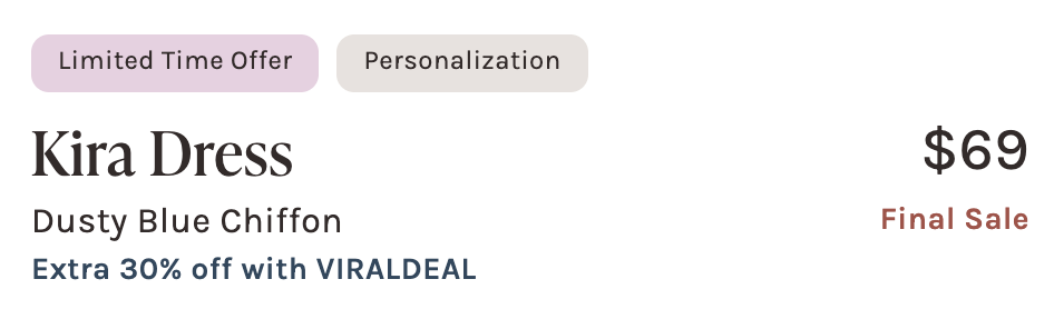
├── Price
│ └── Text Badge - Final Sale ← Conditional (top right)
└── Reviews, Description...
Badge Display Limits
| Badge Type | Max Count | Location | Behavior |
|---|---|---|---|
| Pill Badge | 2 | Top of product info | Top 2 from priority order |
| Text Badge (subtitle) | 1 | Below subtitle | oos/firstswatches/promo (mutually exclusive) |
| Text Badge (final sale) | 1 | Top right (by price) | Separate location |
| Total | 4 | 2 pill + 1 subtitle + 1 final sale |
Note: While the code supports multiple subtitle Text Badges, in practice only 1 displays:
oosandfirstswatchesare mutually exclusive (different product types)- Swatches won't have
promobadges (already free) - Out of stock products rarely have
promobadges
Text Badges
Text Badges display promotional and status-related information. They render in two distinct locations:
- Below subtitle: Status and promo badges
- By price (top right): Final Sale badge
Subtitle Text Badges
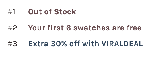
| Variant | Condition | Label | Styling |
|---|---|---|---|
oos | Out of stock + no waitlist | "Out of Stock" | Dark mauve text |
firstswatches | Product type is Swatch | "Your first 6 swatches are free" | Dark mauve text |
promo | Has matching promo tag | Dynamic | Navy/mauve text |
Final Sale Text Badge
| Variant | Condition | Label | Styling |
|---|---|---|---|
finalsale | Has 'finalsale' tag | "Final Sale" | Red text (text-brand-errorText) |
The Final Sale badge renders in a separate location (top right, next to price) and is independent of the subtitle badges.
Promo Text Badge Logic
The getBadgeContent() function determines promo text based on tags (priority order):
| Priority | Condition | Label |
|---|---|---|
| 1 | 'badge:lightningdeal' tag | "Extra 30% off with VIRALDEAL" |
| 2 | 'BMSMWP' tag | "20% off 4+ with TIEONEON" |
| 3 | 'BMSMGR' tag | "10% off 4+ with SUITELOOKS" |
| 4 | 'badge:limited time color' tag | "Limited Time Color" |
| 5 | 'badge:free swatch bundle' tag | "Your First Swatch Bundle is Free" |
| 6 | 'badge:BUNDLEUP' tag | "First Bundle Free with Code BUNDLEUP" |
Note: Promo labels are hardcoded in getBadgeContent(). Update the component when promo codes change.
Usage
<TextBadge
  variant="promo"
  tags={product.tags}
  vendor={product.vendor}
  productType={product.productType}
/>
Pill Badges
Pill Badges are pill-shaped badges with colored backgrounds. Only the first 2 badges are rendered based on priority order.
Pill Badge Priority
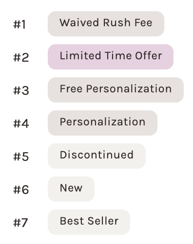
| Priority | Badge | Condition | Background |
|---|---|---|---|
| 1 | EOY Sale | 'badge:eoy25clearance' tag | bg-core-funkyPink-50 |
| 2 | Waived Rush Fee | rushFee === '0.0' | bg-brand-deepBeige-50 |
| 3 | Custom Badge | Tag starts with 'custom-badge:' | bg-core-funkyPink-50 |
| 4 | Limited Time Offer | 'badge:limited time offer' tag | bg-core-funkyPink-50 |
| 5 | Free Personalization | 'badge:free personalization' tag | bg-brand-deepBeige-50 |
| 6 | Personalization | isPersonalizable === true | bg-brand-deepBeige-50 |
| 7 | Discontinued | isDiscontinued === true | bg-brand-deepBeige-25 |
| 8 | New | 'New Arrival' tag | bg-brand-deepBeige-25 |
| 9 | Best Seller | 'Best Seller' tag | bg-brand-deepBeige-25 |
Note: Screenshot excludes Custom Badge and EOY Sale badges since they are dynamic/seasonal.
Usage
<PillBadges
  tags={product.tags}
  isDiscontinued={!!discontinuationDate}
  isPersonalizable={enablePersonalization}
  isGiftCard={isGiftCard}
  isSwatch={isSwatch}
  isSwatchBook={isSwatchBook}
  rushFee={rushFee}
/>
Custom Pill Badges
Products can have dynamic custom badges using the custom-badge: tag prefix:
Tag: "custom-badge:Limited Edition"
Renders: Pill Badge with "Limited Edition" text
Custom Pill Badges are excluded for gift cards, swatches, and swatch books.
Badge Props
TextBadge Props
interface TextBadgeProps {
  variant: 'finalsale' | 'promo' | 'firstswatches' | 'oos';
  tags: string[];
  vendor: string;
  productType?: string;
}
PillBadges Props
interface PillBadgesProps {
  tags: string[];
  isDiscontinued: boolean;
  isPersonalizable: boolean;
  isGiftCard: boolean;
  isSwatch: boolean;
  isSwatchBook: boolean;
  rushFee?: string;
}
Data Sources (Shopify)
Product Tags
Badge triggers from Shopify product tags:
| Tag Pattern | Badge Type |
|---|---|
'badge:eoy25clearance' | EOY Sale Pill Badge |
'finalsale' | Final Sale Text Badge |
'badge:lightningdeal' | Lightning Deal Text Badge |
'badge:limited time color' | Limited Time Color Text Badge |
'badge:limited time offer' | Limited Time Offer Pill Badge |
'badge:free personalization' | Free Personalization Pill Badge |
'badge:coming soon' | Coming Soon status |
'custom-badge:[text]' | Custom Pill Badge |
'BMSMWP' | Bulk purchase Text Badge |
'BMSMGR' | Bulk purchase Text Badge |
'New Arrival' | New Arrival Pill Badge |
'Best Seller' | Best Seller Pill Badge |
Product Metafields
| Metafield | Namespace | Purpose |
|---|---|---|
discontinuation_date | custom | Discontinued Pill Badge (format: yyyy-MM-dd) |
discontinuation_level | custom | Determines discontinuation scope |
enable_personalization | tms | Personalization Pill Badge |
rush_fee | custom | Waived Rush Fee Pill Badge (when '0.0') |
Styling
Text Badge Classes
const variantStyles = {
  finalsale: 'text-brand-errorText capitalize whitespace-nowrap',
  promo: 'text-suits-navy', // or 'text-core-darkerMauve'
  firstswatches: 'text-core-darkerMauve whitespace-nowrap',
  oos: 'text-core-darkerMauve whitespace-nowrap',
};
Pill Badge Classes
Base styles applied to all Pill Badges:
'text-brand-darkerMocha capitalize rounded-[8px] w-fit py-1 px-3 !font-normal text-xs min-h-[26px]'
Background variants:
| Style | Classes | Used For |
|---|---|---|
| Light beige | bg-brand-deepBeige-50 | Waived Rush Fee, Personalization |
| Pink | bg-core-funkyPink-50 | Limited Time Offer, Custom badges |
| Lighter beige | bg-brand-deepBeige-25 | Discontinued, New, Best Seller |
Adding a New Badge
Adding a Text Badge Variant
-
Add variant type in
textBadge.component.tsx:export type TextBadgeVariant = 'finalsale' | 'promo' | 'newvariant' | ...; -
Add styling in the variant styles object:
newvariant: 'text-your-color whitespace-nowrap', -
Add content logic in
getBadgeContent()if needed
Adding a Pill Badge
-
Add condition in
pillBadges.component.tsxuseMemo hook:if (tags.includes('badge:newbadge')) {
badges.push({
label: 'New Badge',
className: 'bg-brand-deepBeige-50',
});
} -
Position in priority order (badges are added in priority sequence)
Tag-Based Badge
To add a tag-triggered badge:
- Define the tag pattern (e.g.,
'badge:newfeature') - Add condition check in the appropriate component
- Configure Shopify to add the tag to products
Testing
Test files are located alongside components:
app/components/PillBadges/pillBadges.spec.tsxapp/components/TextBadge/textBadge.spec.tsx
Key test scenarios:
- Maximum 2 Pill Badges displayed
- Badge priority ordering
- Correct text/styling per variant
- Tag matching logic
Related Files
app/components/TextBadge/textBadge.component.tsx- Text Badge componentapp/components/PillBadges/pillBadges.component.tsx- Pill Badge componentapp/components/ProductInfo/productInfo.component.tsx- Badge rendering locationapp/routes/products.$handle.tsx- Product page data fetchingapp/lib/constants.ts- Badge-related constants
Differences from PLP Badges
| Aspect | PDP | PLP |
|---|---|---|
| Repository | hydrogen-storefront | static-assets |
| Framework | React/Remix | SearchSpring |
| Rendering | Client-side components | Server-side afterStore hook |
| Pill Badges | Max 2 (priority system) | None |
| Text Badges | 2 max (1 subtitle + 1 final sale) | 1 max (priority system) |
| Image Badges | None | 1 max (same position) |
| Total max | 4 | 2 |
| Styling | Tailwind classes | SCSS + inline styles |